Recreational research into Feudal Japan
Comparing O-umajirushi (2/?)
Continuing my comparison between the National Diet Library and Library of Congress copies of O-umajirushi.

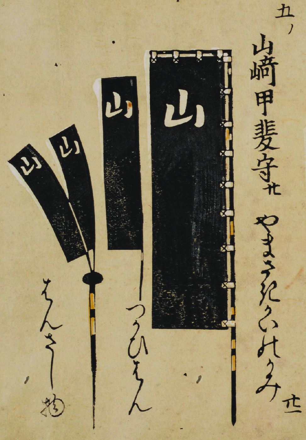
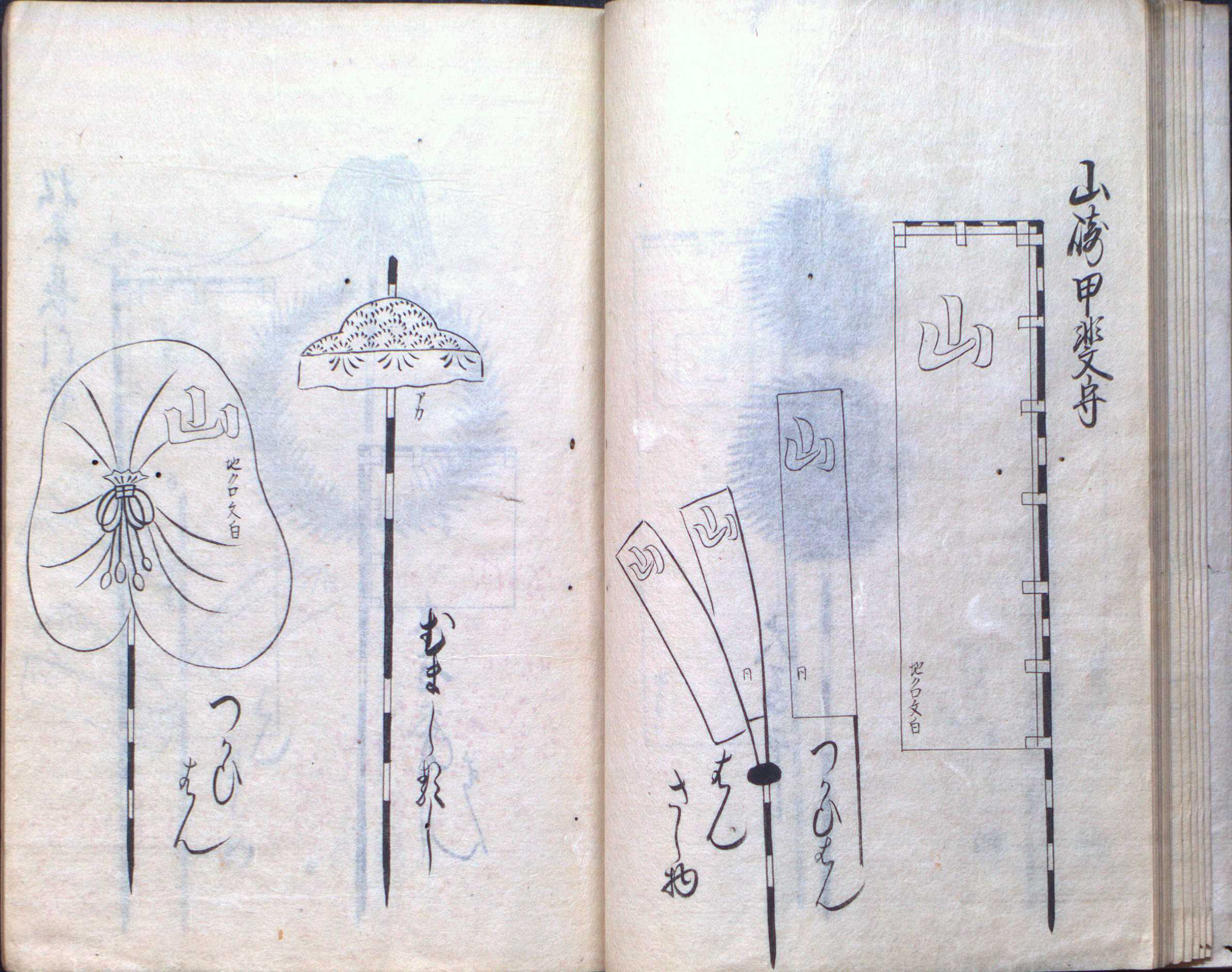
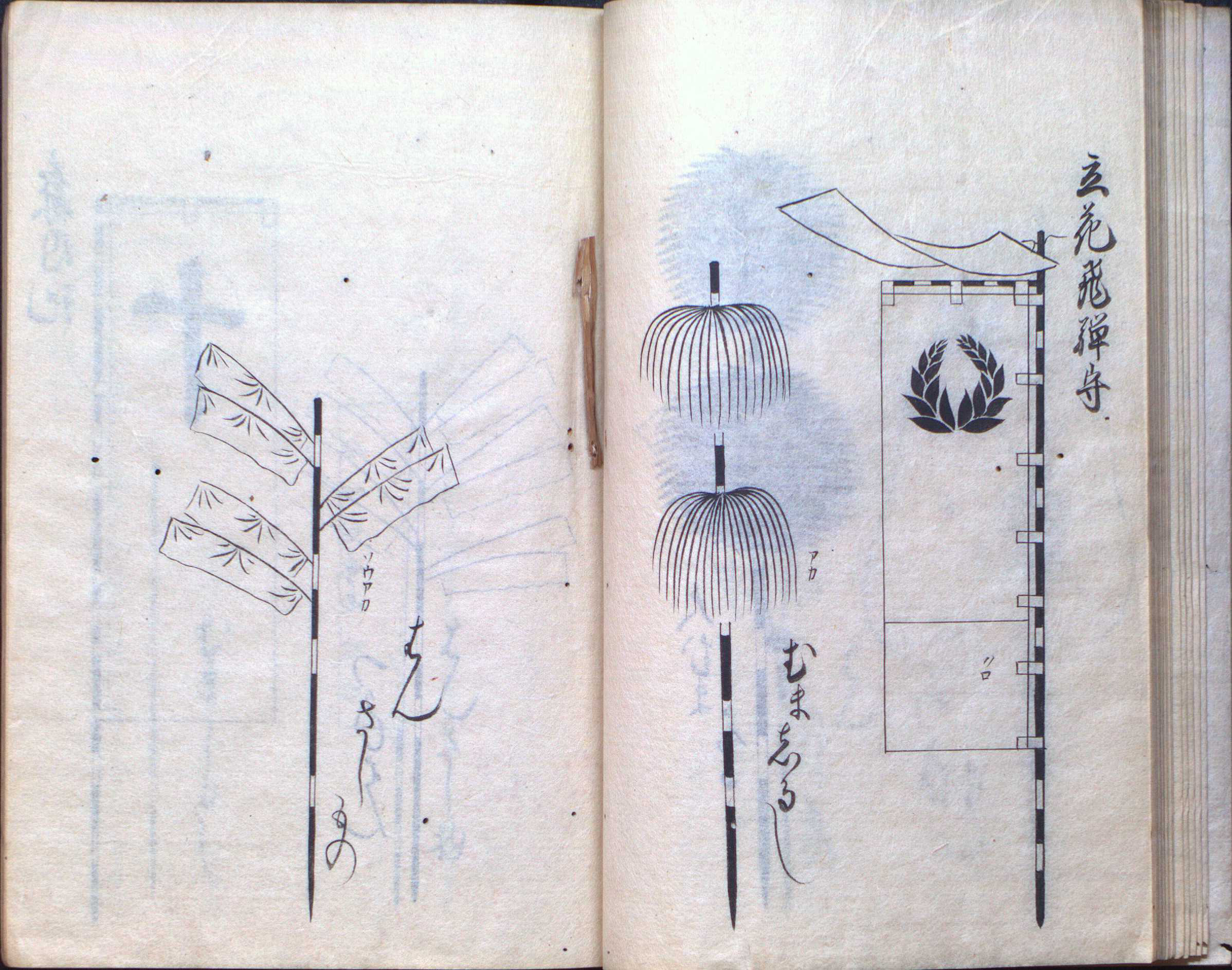
Here it’s interesting to note that both copies have have different styles of the character yama (山) on the horo from the banners, and that the styles match. Whether this shows significance of the style difference or is just a result of attention to detail when copying is hard to say, though given that it’s the same holder an important difference seems unlikely. The smaller yama banners are marked 同 (onaji, the same), indicating that they share the ground-black-mon-white coloration of the larger banner.
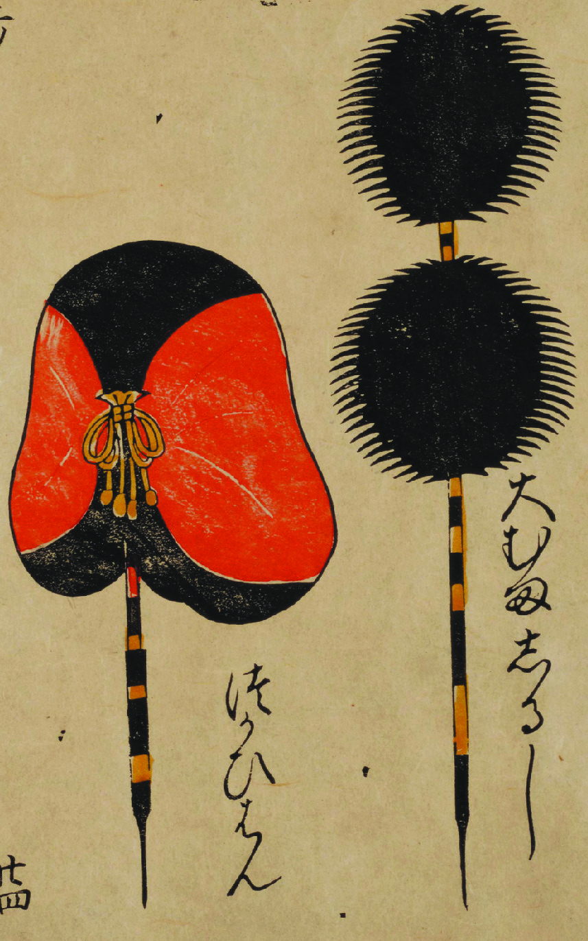
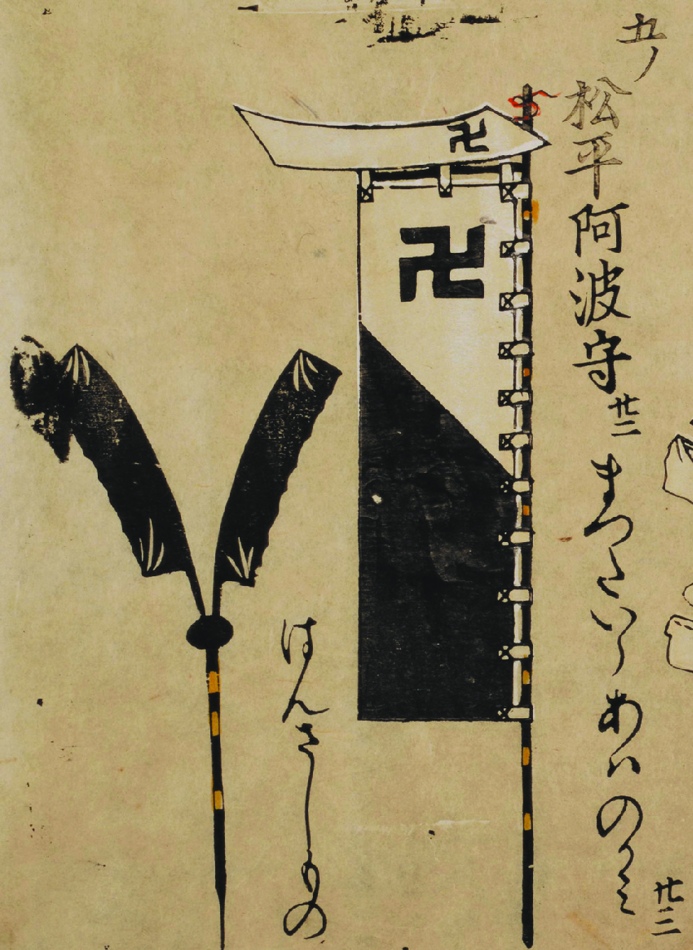
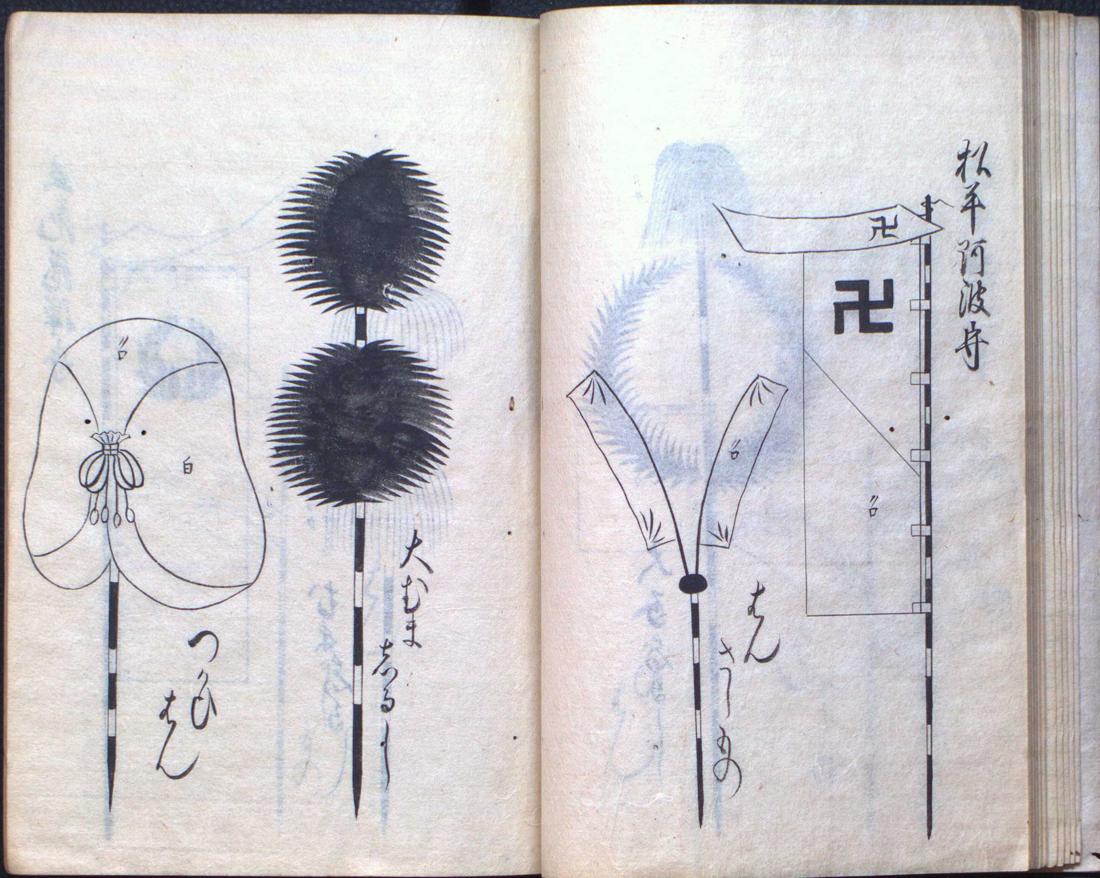
Here the swastikas are drawn in a slightly different style in the two versions. Also, the horo on the left has its side panels labeled white, not red, in the LoC version.

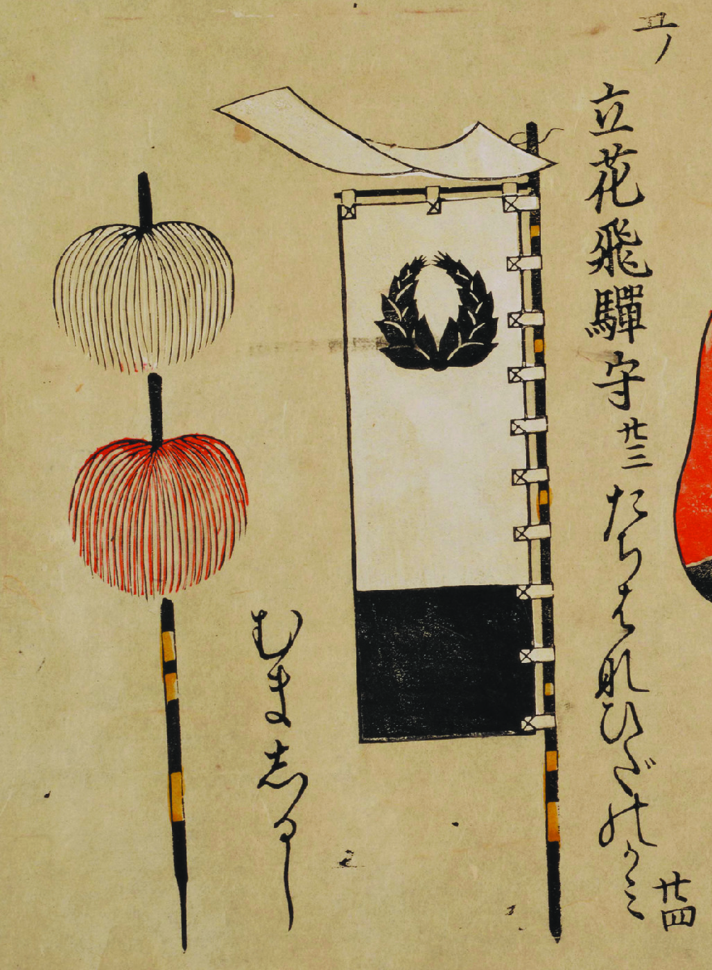
In the LoC version, the mon here is drawn a bit differently, with more distinct separation between the leaves. Note also in general that the placement of cloth strips attaching banners to poles and the detailing on poles is different between the versions, showing that these details were insignificant.
Join me next time when my picayune comparisons move on to Volume 6.
(Research for this post was conducted at the Library of Congress and was facilitated by the staff of the Asian Reading Room.)
Comments are closed.
