Recreational research into Feudal Japan
Archive for June, 2016
Resource: the Rijksmuseum
Jun 30th (a Shakkō (赤口))
I recently discovered that the Rijksmuseum, the Dutch national museum, has their collection searchable online with freely-usable images. They’ve got some cool stuff. Here are some highlights, focused on Japanese heraldry.
<img src="http://fireflies.xavid.us/wp-content/uploads/2016/06/Screen-Shot-2016-06-30-at-13.48 traitement viagra naturel.50-300×114.png” alt=”Screen Shot 2016-06-30 at 13.48.50″ width=”300″ height=”114″ class=”alignnone size-medium wp-image-594″ srcset=”http://fireflies.xavid.us/wp-content/uploads/2016/06/Screen-Shot-2016-06-30-at-13.48.50-300×114.png 300w, http://fireflies.xavid.us/wp-content/uploads/2016/06/Screen-Shot-2016-06-30-at-13.48.50-768×293.png 768w, http://fireflies.xavid.us/wp-content/uploads/2016/06/Screen-Shot-2016-06-30-at-13.48.50-1024×390.png 1024w, http://fireflies.xavid.us/wp-content/uploads/2016/06/Screen-Shot-2016-06-30-at-13.48.50.png 1506w” sizes=”(max-width: 300px) 100vw, 300px” /> 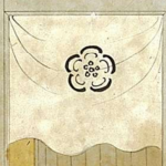
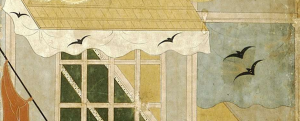
These details from “Arrival of a Portuguese ship”, c. 1600, show mon used on noren (fabric dividers). Of particular interest is the double bird mon that is reduced to a single bird on the smaller noren, showing a notable type of variation, and also the differences of background color between the large and small noren.
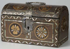
This box, from 1600-1650, shows wood sorrel and chrysanthemum mon with a “seven treasures” background pattern. The use of mother-of-pearl creates an interesting three-color effect, with two colors for the mon and one for the background.
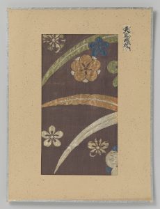
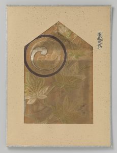
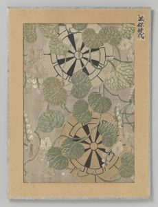
These fabric fragments, from 1573–1591, 1575–1600, and 1644–1648, respectively, show how mon designs could be used in embroidery.
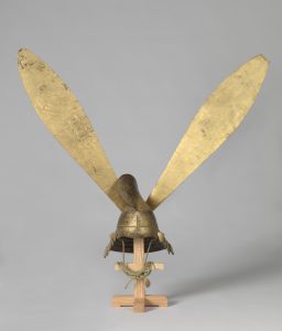
And finally, this heraldic helmet with enormous gold ears is from 1575–1600.
I’m definitely a fan of museums making their collections widely available like this, having used the online collection from the Met extensively for context in my O-umajirushi translation. Enjoy the collection!
Comparing O-umajirushi (1/?)
Jun 25th (a Senshō (先勝))
So, when I went to the Library of Congress last fall, I got to see physical copies of volumes 5 and 6 of O-umajirushi in person, which was very exciting. What was interesting, though, is that these copies had some differences from the copies from the National Diet Library which I used for my book. Notably, this version was in black and white with colors labeled in text, like the copy of Shoshō Kisei Zu I referred to. Other than that, they were largely the same, with the same contents and ordering and only minor differences to the depictions. (The LoC version also had some insect and water damage.) However, in some cases it’s interesting to compare and look at some of these differences, and I’d like to talk about some examples. I’ll start with a few from volume 5, and do more in future posts.
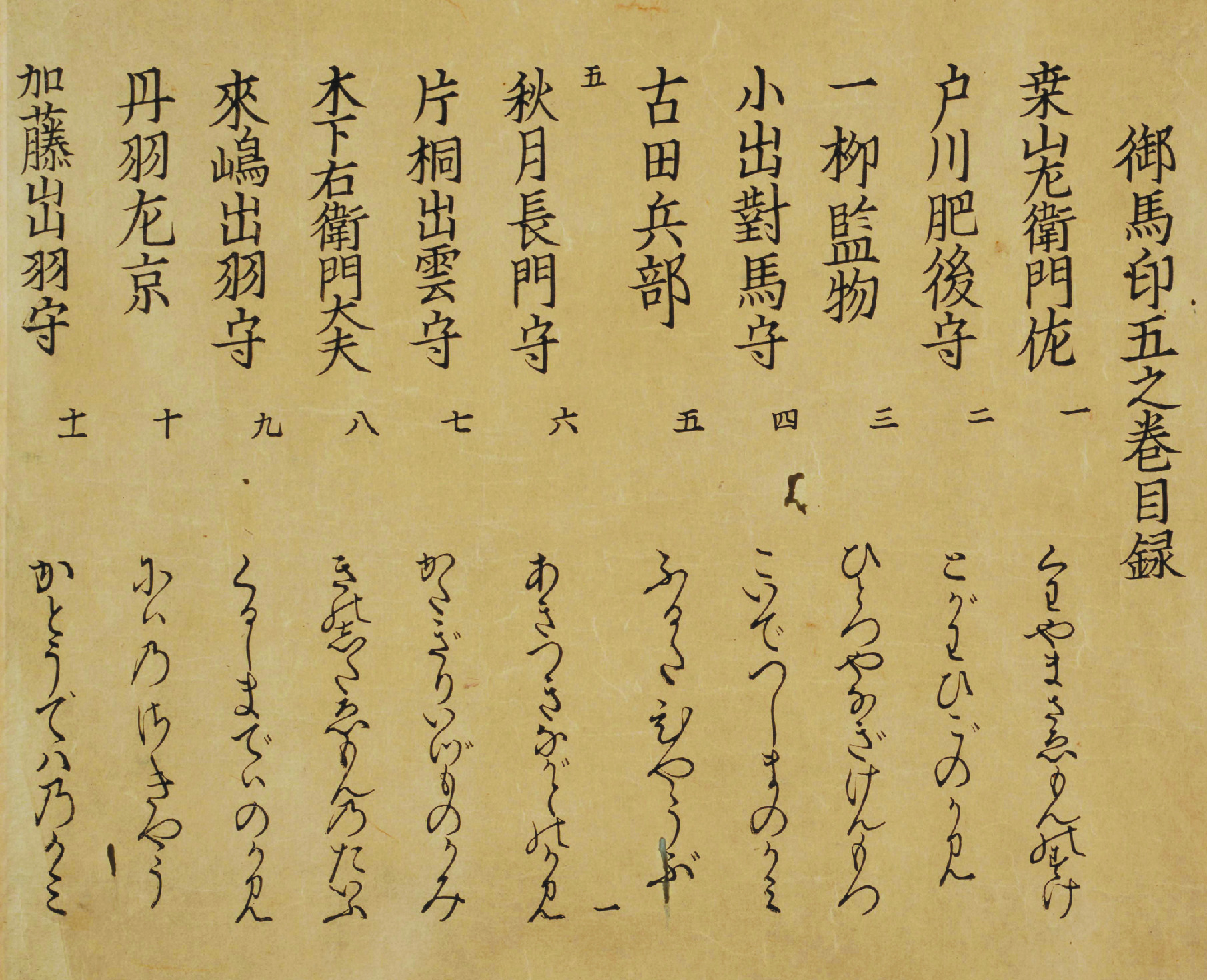

To the left is the table of contents of Volume 5 in the NDL copy, and to the right is the LoC version. The LoC version is more compact and doesn’t include entry numbering or phonetic renditions of the names.
 <img src="http://fireflies.xavid.us/wp-content/uploads/2016/06/c-c-300×240 commander du viagra en belgique.jpg” alt=”c c” height=”225″ class=”alignnone wp-image-573″ srcset=”http://fireflies.xavid.us/wp-content/uploads/2016/06/c-c-300×240.jpg 300w, http://fireflies.xavid.us/wp-content/uploads/2016/06/c-c-1024×819.jpg 1024w” sizes=”(max-width: 300px) 100vw, 300px” />
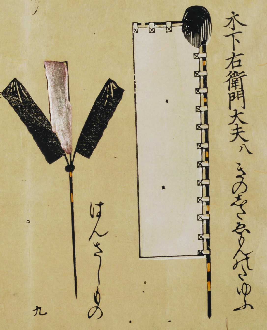
This page shows the close similarities of many of the drawings, down to such details as the position of individual paper streamers. The labels follow the style of the table of contents. Because the LoC copy is folded into a bound book instead of a scroll, the two pages shown here are each half of different “pages” in the NDL scroll version. In the LoC version, the banners on the left are labeled クロ (kuro; “black”) and ギン (gin; “silver”), and the streamers on the right are labeled ソウ金 (sō kin, “all gold”), all matching the colored version. Worm damage is visible in the lower corners.
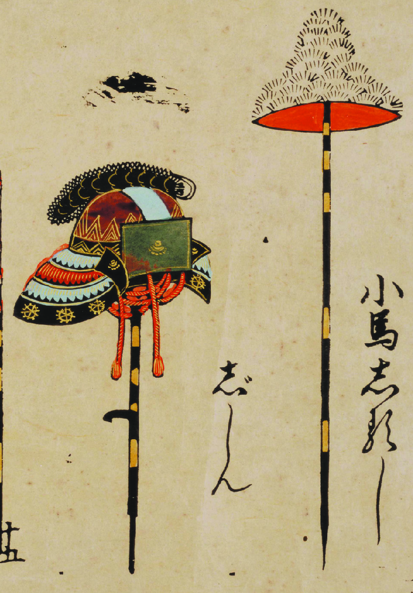
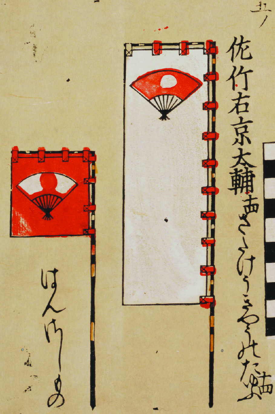

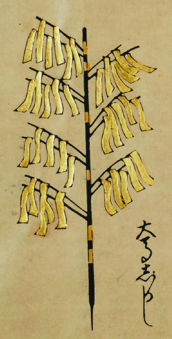
Here, while much of the color details of the helmet on the left are unspecified, the front piece is specifically labeled アヲ (ao, “green or blue”), showing that that in particular was important for identification. Like Shoshō Kisei Zu does, the LoC text specifies that the hat shape is covered in サルゲ (saruge, “monkey fur”), but for color only notes the red of the inside. For the banners with the three-color fan mon on the right 地アカ (ji aka, “ground red”) is used both to describe the red background of the left banner and of the right fan, showing that the backgrounds of banners and fans were considered similarly.
That’s all for tonight. Until next time!
(Research for this post was conducted at the Library of Congress and was facilitated by the staff of the Asian Reading Room.)
